Available since 4.6.0
A WooCommerce checkout for foldable phones and the iPhone Duo
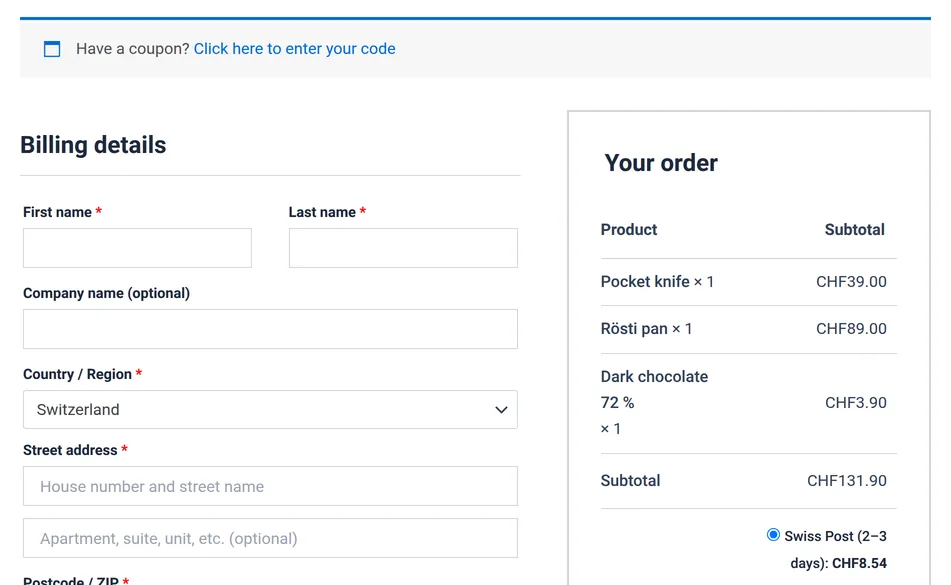
Half-open like a book, the hinge runs through the checkout form: on WooCommerce's own checkout it crosses the name, company and address fields. OnePageCheckout gives each posture its own layout, with the crease as the divider.
Free and Pro, classic and block checkout. Desktop and phone layouts stay as they are.
Drag a phone, or use the buttons
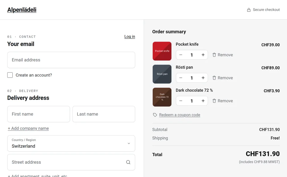
A WooCommerce checkout works on foldable phones: the fields and the Pay button behave as they do on any phone. The trouble is the layout. A checkout built for two screens, phone and desktop, meets a screen that is neither: about 700 to 1,000 CSS pixels wide when open, and split in two when half-folded. OnePageCheckout puts the form and the order summary on either side of that split, in every browser that gives it the width and, where the browser reports the fold, exactly along the crease.
We are TrafficFlow, an agency in Zurich, and we make OnePageCheckout, a WooCommerce checkout plugin that is free on wordpress.org. We checked our own checkout at the screen sizes of ten foldable device profiles: Google Pixel 11 Pro Fold, Samsung Galaxy Z Fold8, Z Fold8 Ultra and Z Flip8, vivo X Fold6, Motorola razr ultra 2026, razr 2026 and Razr Fold, Apple iPhone Duo, and the 2024 Honor Magic V3 one of us carries, in both of the plugin's checkout engines. The captures on this page ran in Chromium, the engine behind Chrome, with the fold reported to the page the way a real phone reports it, at Android sizes computed from each phone's resolution and at the iPhone Duo sizes WebKit publishes for Safari.
What a foldable does to a WooCommerce checkout
A foldable phone gives a checkout four different screens:
- Folded: a phone, 360 to 475 CSS pixels wide on the devices we measured.
- Open flat: on a book-style foldable, a small tablet about 700 to 1,000 pixels wide. The iPhone Duo held sideways gives a page 951 × 585 pixels (WebKit). A flip phone opened flat is an ordinary tall phone.
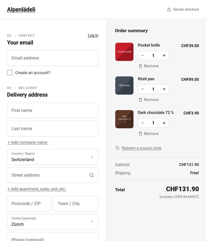
- Half-open like a book: two panes side by side, with a crease down the middle. A checkout that only knows the screen's width puts whatever is in the middle of its page on that crease: on WooCommerce's own checkout, the name and address fields.
- Half-open like a laptop, which Android calls tabletop: a pane to look at and a pane under your thumbs.
Apple's first foldable, the iPhone Duo, went on sale on 23 October 2026 (Apple Newsroom). Counterpoint Research expects foldable shipments to grow 21% in 2026, with Apple taking a 25% share (Counterpoint Research).
What OnePageCheckout does in each posture
Our one-page checkout plugin for WooCommerce has three layouts for the screens between phone and desktop, built from parts the desktop checkout already has. Each applies only where its condition is met, so a desktop browser 1,000 pixels or wider and an ordinary phone never see them. The phones below are drawings; the screens in them are real captures of the same shop and cart, taken in Chromium at the sizes of a Galaxy Z Fold8.
Open flat: form and order summary side by side
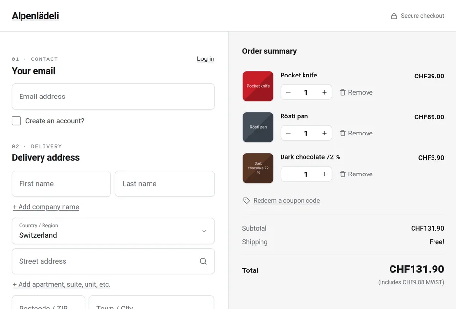
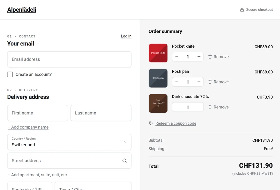
From 700 pixels wide and 480 tall, the order summary moves next to the form. From 900 pixels the two columns are equal, so on the Galaxy Z Fold8 and the iPhone Duo, whose hinge is in the middle, the line between form and summary lands on the crease even when the browser doesn't know where the crease is. Below 700 pixels the single column stays: a usable form and a usable summary don't both fit.
Drag a phone, or use the buttons
Half-open like a book: the crease becomes the divider
When the browser reports two panes side by side, the form fills the left pane and the order summary the right, with 28 pixels of space on either side of the crease. On every device profile that reports the fold, nothing sits on the crease, in both engines. On the Galaxy Z Flip8 and the razr ultra, whose half-open panes are about 340 pixels tall, the summary keeps a short scrolling item list, the coupon link and the total, so the total is on the first screen.
Drag a phone, or use the buttons
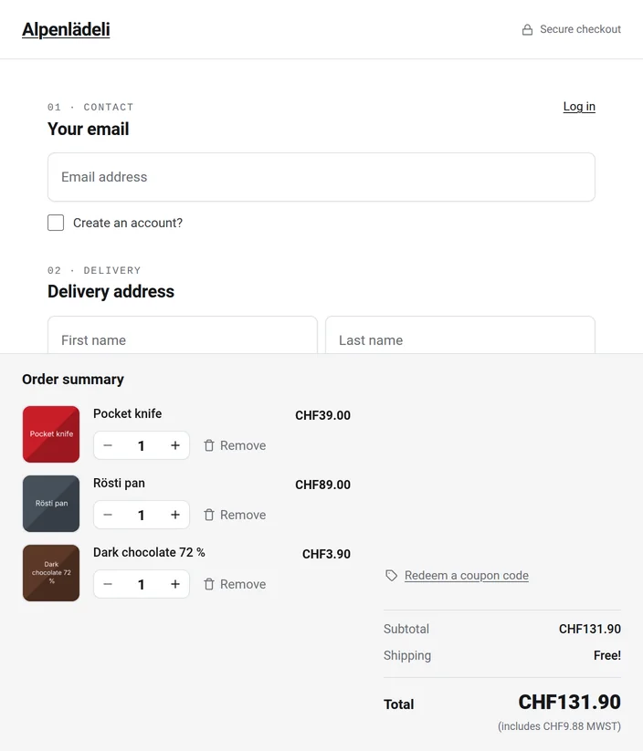
Half-open like a laptop: an order summary deck in the bottom half
The form scrolls in the top pane. The bottom pane is a fixed deck with the items, the coupon link and the total. While the customer fills in the form, the keyboard covers the bottom pane, which is the deck, and the form keeps the top pane: Chrome on Android doesn't shrink the page when the keyboard opens (Chrome for Developers). A summary at the bottom of the screen felt odd to us at first, so try it on the prototype before you judge it.
Drag a phone, or use the buttons
The Pay button stays in the form
We decided against a second Pay button in the summary pane. Some gateways replace that button with their own, such as Stripe's wallet buttons or PayPal's smart buttons, and validation errors have to point at the form. A copy would be a second way to submit an order. What stays in view instead is the total.
Which browsers see which layout
The open-flat layout depends only on the screen's width, so every browser gets it. The half-open layouts need the browser to report the fold through the Viewport Segments API, which arrived in Chrome 138 in June 2025 (Chrome for Developers). On a single flexible screen it reports two panes only while the phone is half-open.
| Browser | Open flat | Book and tabletop |
|---|---|---|
| Chrome and Edge 138 or later | Yes | Yes |
| Samsung Internet 30 or later | Yes | Yes (caniuse) |
| Firefox | Yes | No |
| Safari 27.1 on iPhone Duo | Yes | Only behind a feature flag |
A browser without the API shows the open-flat or the phone layout. Nothing breaks. The phone also has a say: half-open like a laptop, our Honor Magic V3 gives Chrome only the upper half of the screen and leaves the lower half black, so the page gets a short phone layout there instead of the deck. Book and open flat work on it as shown.
The iPhone Duo in Safari 27.1
Safari 27.1 has both fold APIs on the iPhone Duo as a developer preview behind feature flags, which each user has to turn on in Settings, and WebKit asks for layouts that "simply work on every sized screen" (WebKit). For practically every shopper, the iPhone Duo is a set of page sizes:
| iPhone Duo | CSS px (WebKit) | OnePageCheckout |
|---|---|---|
| Folded | 382 × 580 | Phone layout |
| Open, upright | 669 × 867 | Single column |
| Open, sideways | 951 × 585 | Two equal columns, divider on the crease |
Without the APIs, a half-open iPhone Duo gives the page the same size as open flat, which is why the two phones at the top of this page show the same page flat and half-open. Sideways, the equal columns already put the crease between form and summary. Upright and half-open like a laptop, the crease still crosses the single column. The book and tabletop rules use the same standard API, so they are written to apply in Safari too once it reports the fold.
What stays the same
- Desktop and phones. Full-page screenshots of both engines at 1280 × 800, 1440 × 900, 390 × 844 and 360 × 780, with and without the foldable rules: 0 pixels differ.
- Cover screens, and open screens under 480 pixels tall while flat, keep their layout.
- Your setup. No template or markup changes, nothing to translate. Your skin and settings still apply, including the Pro option that puts the summary on the left.
One change outside foldables: tablets held upright and desktop windows between 700 and 999 pixels wide (and at least 480 tall) get the side-by-side checkout layout instead of the single column. It is the desktop layout, a little narrower.
Try it on your foldable
The live prototype is a static copy of the OnePageCheckout checkout, three products in the cart, with the foldable layouts applied. Nothing you type is sent anywhere.
- Open the live prototype in Chrome, Edge or Samsung Internet on the foldable and pick the classic checkout or Block Mode.
- Unfold the phone flat, then half-open it like a book.
- Turn it and half-open it like a laptop.
A small panel shows what the phone reports: page size, segments and posture. To check any other checkout, half-fold the phone and look at what sits on the crease.
Open the live prototypeQuestions people ask
Does a WooCommerce checkout work on foldable phones?
Yes. The fields and the Pay button work as on any phone. What goes wrong is the layout: WooCommerce's checkout only knows the screen's width, so half-open like a book, the fold runs through whatever the theme puts in the middle of the page. On the Astra theme at the iPhone Duo's open size that is the name and address fields, next to the order table. OnePageCheckout puts the form and the order summary on either side of the fold.
Does my website need changes for the iPhone Duo?
Probably not, if it is already responsive. WebKit asks for layouts that work at every screen size and for feature detection instead of user-agent sniffing. Check the page at 669 pixels wide and at 951 × 585, the two open sizes. Safari 27.1 tells a page about the fold only if the user turns on two feature flags.
What viewport sizes does Safari give a page on the iPhone Duo?
According to WebKit, in CSS pixels (width × small viewport height): 382 × 580 folded, 594 × 368 folded and sideways, 669 × 867 open and upright, 951 × 585 open and sideways, and 385 × 571 for each of two windows side by side.
What is the Viewport Segments API?
A web API that tells a page where a fold divides the screen, in Chrome and Edge from version 138 and Samsung Internet from version 30. CSS gets the media features horizontal-viewport-segments and vertical-viewport-segments and env() variables with each pane's size, such as env(viewport-segment-width 0 0) (MDN); JavaScript gets window.viewport.segments. Firefox doesn't support it, Safari only behind a flag.
Which version has the foldable layout, and do I have to set anything up?
OnePageCheckout 4.6.0, free and Pro, both checkout engines. Sites running OnePageCheckout get it with the normal plugin update, and there is nothing to configure.
Will my checkout change on desktop or on phones?
No. Our full-page screenshots of both engines are identical to the pixel at two desktop and two phone sizes. Screens from 700 to 999 pixels wide and at least 480 tall get the form and the summary side by side.
Why isn't the Pay button on the second half of the screen?
It stays at the end of the form, where WooCommerce and your payment gateway expect it. A copy in the other pane would be a second way to submit an order. The total stays in view instead.
Does it work with the classic and the block checkout?
Yes. Every measurement on this page was taken in both of OnePageCheckout's engines: the classic checkout and Block Mode, which runs on the WooCommerce Checkout block.
Try it, then install it
OnePageCheckout is free on wordpress.org, including 500 address lookups a month. Version 4.6.0 and later include the foldable layouts, free and Pro, and WordPress offers the update like any other. Pro adds more lookups and design options: Pro plans and pricing.
Setup guide Live demo checkout Shopify-like checkout for WooCommerce
Deactivate the plugin and WooCommerce's standard checkout is back.
The phones on this page are drawings, not product images. iPhone is a trademark of Apple Inc., Galaxy of Samsung Electronics, Pixel of Google LLC; other product names are trademarks of their owners. OnePageCheckout is an independent WooCommerce plugin by TrafficFlow GmbH and is not affiliated with them.